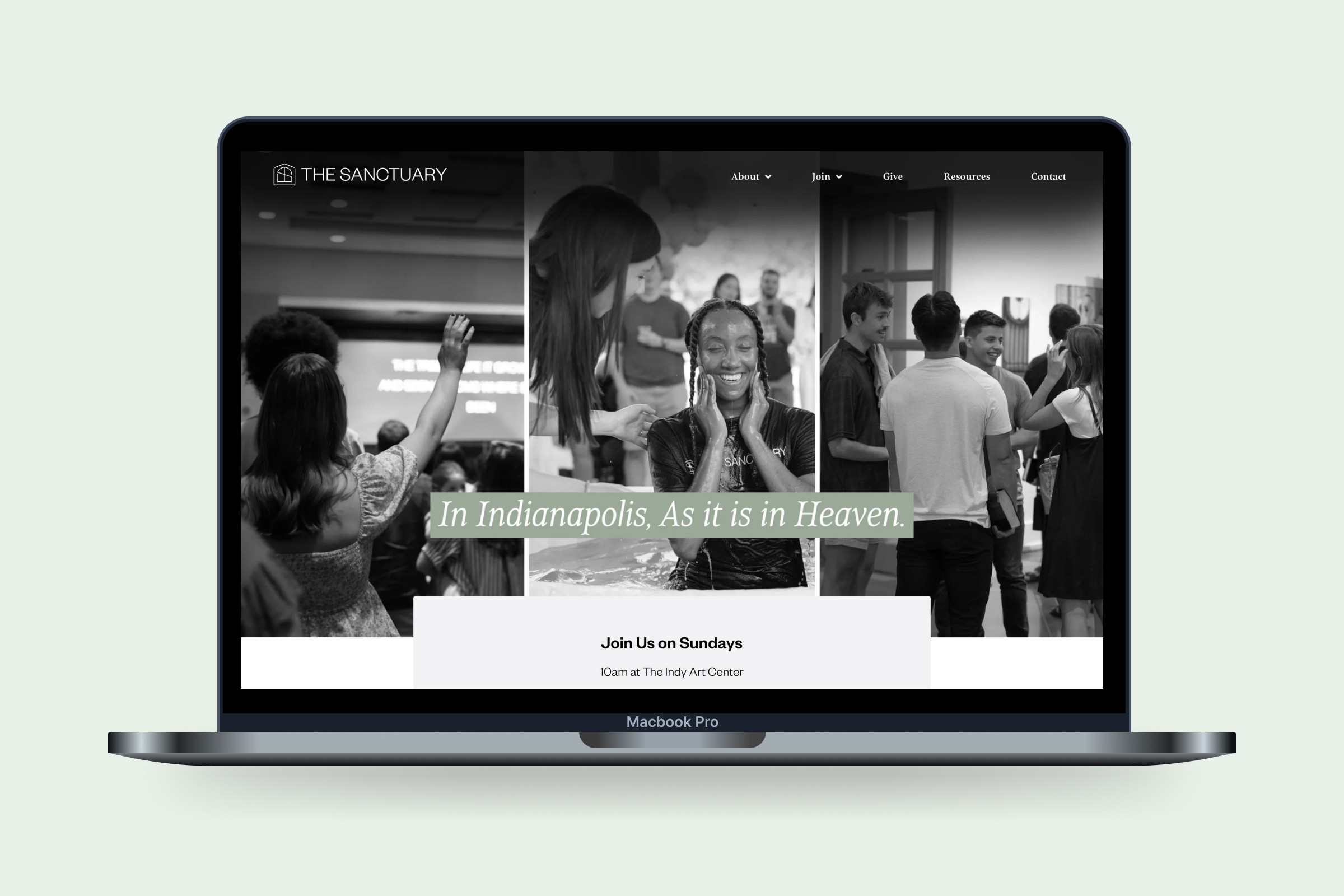
Crafting a church identity that feels right at home
Project Summary
During the church planting process, The Sanctuary came to me to develop a brand identity and create a website that would establish who they want to be.
My Contributions
Logo design
Brand identity
Typography design
Website design & development
Brand Identity
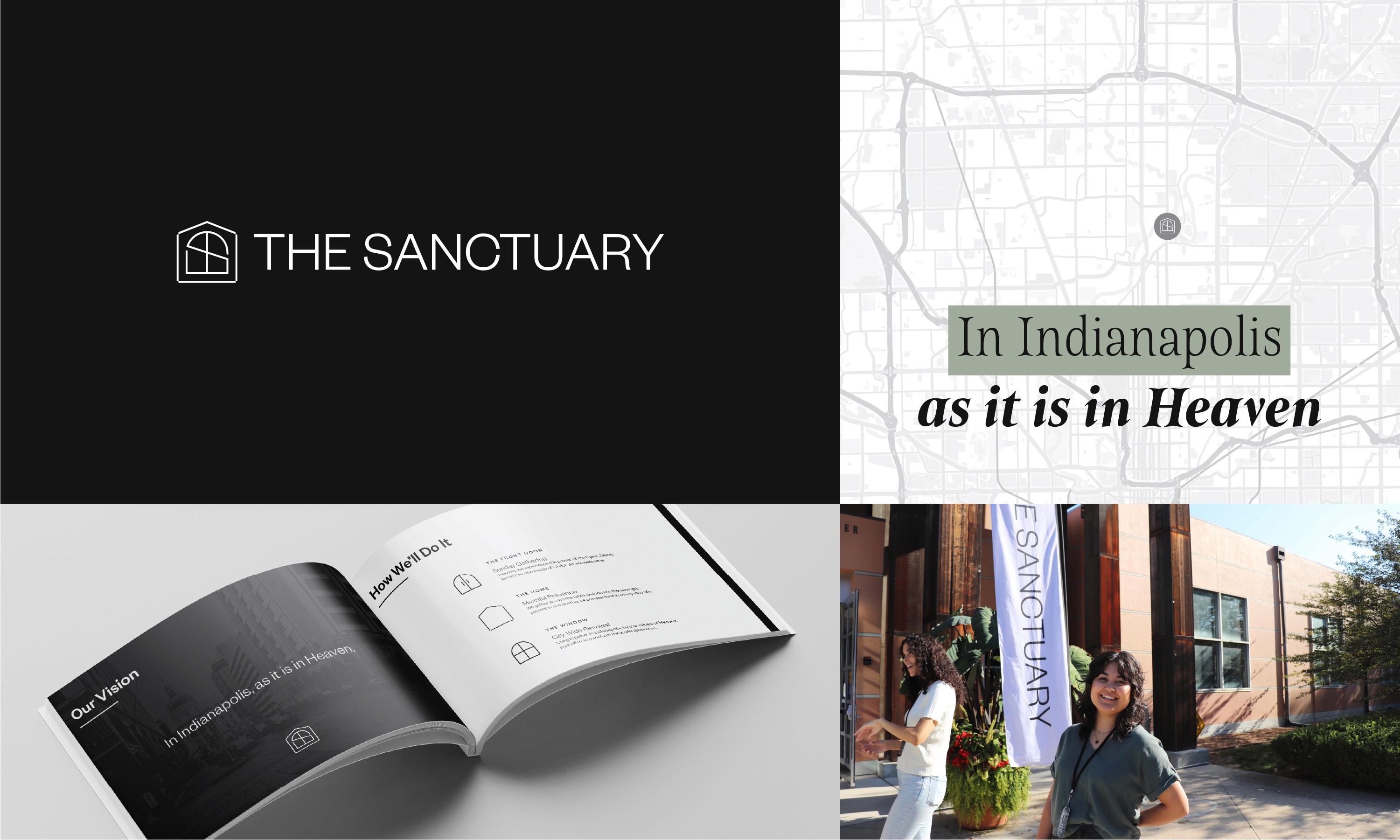
The team wanted their identity to be welcoming to everyone and "a haven for broken people". We created three visual identifiers to symbolize the brand: a front door, a window, and a home.
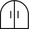
The Front Door
The welcoming entrance point

The Window
The inviting culture and focus on being seen
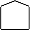
The Home
A place to belong
Logo Design
For the logo mark, it was important to incorporate all three of these identifiers to wholly symbolize who The Sanctuary is to be. Finding a unique blend of all three, I created the final mark.
Color Development
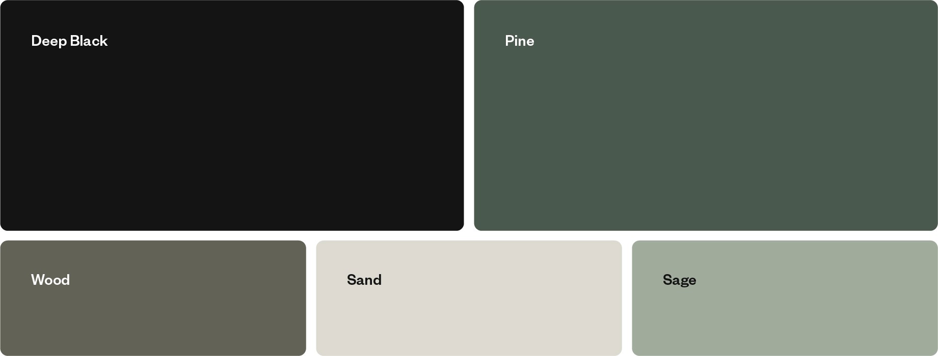
To compliment the grounded and simple approach to their ministry, I used neutral colors and earth tones as the primary color palette.
Typography
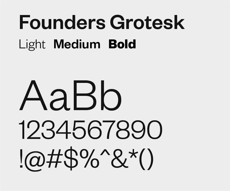
The find type to compliment the brand, the goal was to find a straightforward, no frills typeface that had multiple weights for variability and high legibility. Founders Grotesk was the type family that ticked all the boxes.
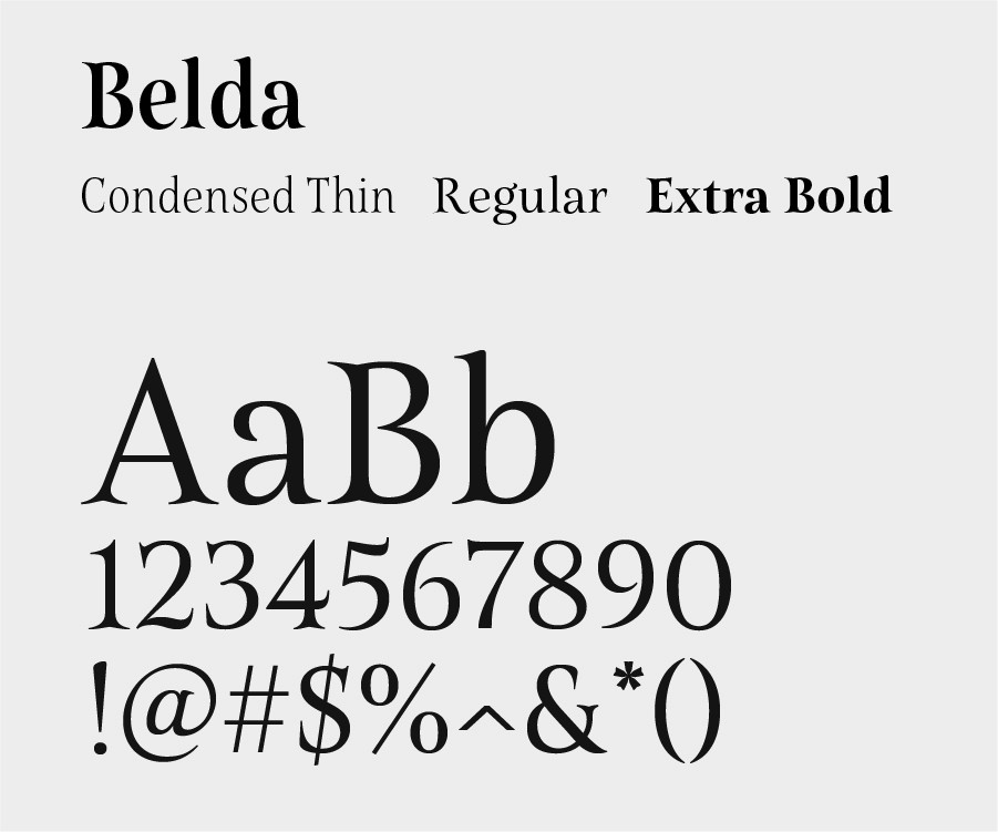
As a secondary font family to pair with Founders Grotesk, I chose Belda for its touch of character in the serifs and its unique flair.
Website
The website is a place for new visitors to learn about the church and a hub for members to engage — all wrapped in a friendly and clear approach.

